7 Pro Tips To Know For Mobile eCommerce Website 2020-21…Part II
 September 30, 2020
 E-commerce Development Services Mobile Apps
“If you’re competitor focused, you have to wait until there is a competitor doing something. Being customer-focused allows you to be more pioneering.”
The eCommerce market has quickly matured and the present scenario is all about making things easier and better for the consumer (the user). Through these two blog series on mobile e-commerce website design tips we have explored and discussed some better ways to design your website to ensure your target audience shows interest in your services.

With every new website design, we try to create a better user experience for your customers so that your brand/business gets the attention you deserve. Let’s find out the next pro-tips you need to know to make your mobile e-commerce website a successful one.
As we have already discussed the first three tips in the last blog, so here are the next four pro tips on improving your mobile eCommerce website:
4. Pinch Zooming Is Passé:
Mobile websites and design trends come and go and in order to thrive between these changing trends, you must stay updated and aware of what is working for the consumer and what is no more essential.
The pinch zoom feature was quite an in the spotlight a few years back but today it is not that much preferred by designers. For your mobile e-commerce website, you need to focus on proportions.
Make the ratio of every element in the right proportion to the overall screen size, so whether it is font size, image displayed, every minute element should contribute to the screen size of the mobile on which the user will be viewing your website. Using the right proportion will clearly make the pinch zooming factor nonessential.
Your e-commerce site will have various factors that play important roles in making the whole site/services more persuasive to the customer (which will help in conversion). Apart from product images, you must also pay attention to the product description as it is very likely the user will check out the information available about the target product before moving to add to the cart section.
Here Are Some Key Points to Improve User Reading Experience and Optimizing the Typography of the Product Description:
• Use fonts that are easily readable. The use of very small fonts not advised.
• Using up to 30 to 40 characters per line will enhance the user readability factor without making the product page look too crammed.
• Font color should be wisely chosen in such a way that it is in contrast with the background color.
5. Pay Attention To The Thumb Zone:
Major studies conducted to decipher how people engage and use through mobile phones have found that almost 49 percent of mobile users are comfortable scrolling through their phone single-handedly.
Also, almost 75 percent of mobile users are more used to using thumb when using their devices. So, considering the screen size of the mobile, we can have three zones which will categorize the thumb movement into natural, stretching, and hard.
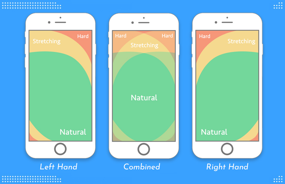
When designing your eCommerce website for mobile platform, make sure to place the services and highly important elements of your mobile site in this easy to scroll areas (in short, areas where the thumb can easily reach, so that the user can perform their site navigation without having to switch between their fingers). For secondary and tertiary level important elements can be placed on the stretched as well as hard to reach areas of the mobile screen.
Another great advice would be to avoid using tiny clickable links which can often frustrate the user, rather go for a more user-friendly design for such site elements like wider boxes.
6. You Can Make Good Use Of The Three-Tap Rule:
A great way to improve your conversion rate is to work on the UX of your website. Talking about e-commerce and mobile website; the more simple and user-friendly design you have, the more chances are that users will stay on the site and engage with the website/its products. So, we have this simple three-tap rule which means that it should take no more than three taps for the user to reach their desired page/product once they have landed on the home page.
To Summarize the Three-Tap Rule, It should work for the customer journey something like this:
• User visits/lands on the home page. The first tap is made to choose the product category.
• The user will make the second tap to find the sub-category.
• The third and the final tap will take the user to the desired product page.
Once the user has visited the product page, they can directly move to the checkout page.
Find out how you can improve the user experience on your mobile website and what elements in the design are a must! For the latest Mobile Web Development and Design Services from India, you can reach out to us.
7. Make Sure To Optimize The Shopping Cart:
When we are trying to make a conversion happen, it is not about focusing just on the first step (the landing page) but it is about focusing on every step and making sure the consumer is reaching the checkout page and successfully completing the process.
There has been a 69.57 percent of cart abandonment rate in the year 2019 for the online buyers and that means almost 4.6 trillion dollar worth of items were not bought once it reached the checkout point on the eCommerce site.
One main reason behind sites not getting satisfactory conversion rate is because business focuses only on the refining their product pages and landing pages without optimizing the shopping cart page/section.
Some Quick Tips to Improve your Shopping Cart Design are as under:
• Rather than asking the customer whether they want to add the product to the cart, it is better to directly add the item to the cart and send out a notification that informs the customer that the target item has been added to their cart.
• For your mobile user, make sure the checkout page is not overly long and you only ask for the essential details.
• User/customer should be able to checkout without having to create a profile. They can guest login and checkout and that way you are making the buying process a lot easier for the consumer.
• The shopping cart must list the relevant details of the items that are in the cart. Important details such as product quantity, price, etc.
Conclusion:
The ultimate goal of any eCommerce website or mobile site should be to offer a seamless and hassle-free user experience to the consumers so that they can complete the buying process effortlessly. If you don’t have the right resources to get started on building your e-commerce business site then you can reach out to us. Midas focuses on making website designs highly efficient and creative so that your customers can get a phenomenal user experience on your websites. Give Us A Call Today To Know More About Our Services. Midas is your mobile website design and development service provider in India and you can hire the best website design/development services at a nominal price.
popular post
-
Top 8 PHP Frameworks For Website Development 2023…Part I

-
Image Optimization To Rank Your Website On Visual Search Results 2023…Part II

-
11 Mistakes To Avoid When Planning For Web Application Development 2021…Part II

Categories
- Internet Marketing (13)
- Software Development (8)
- Mobile Apps Development (44)
- Web Designing (32)
- Web Development (60)
 business@midaswebtech.com