8 Responsive Web Design Principles To Enhance User Experience 2023
 July 14, 2023
 Web Development Services Website Development Services
“Responsive Web Design always plays an important role whenever going to promote your website.” – Josh Wilson
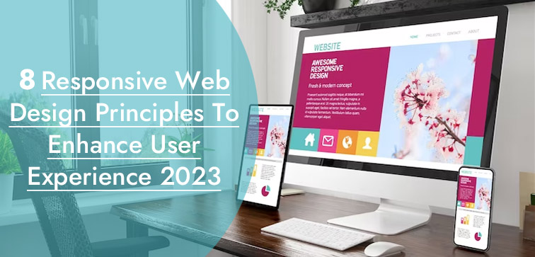
More than 50% of web traffic comes from mobile devices; that’s enough data to ascertain the relevance and significance of mobile users in today’s age of online business. Responsive web design is “the future of the web” and the only way to future-proof your website is to design it responsive.
This way, every time a new mobile device is introduced in the market, your responsive site will adapt to it and provide a seamless user experience to the users of the device.
In this blog, we cover eight responsive design principles that provide valuable insights into responsive website designs and help you create one for your business website.
If you are seeking professional assistance in website development, you can reach out to Midas for the latest Web Development Services today! Call now for more details!
8 Important Principles Of Responsive Web Design Are As Under:
1. Mobile-First Approach (Work Small Screens First):
As the name clearly suggests, this principle of responsive design considers taking the approach of working on small screens first.
The prime focus should be designing a website for mobile devices first. By doing so, you optimize your site design to adjust to the small screens and its limited bandwidth and processing potential.
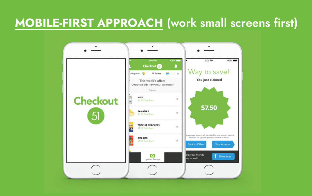
This approach helps you to improve design efficiency, simplicity, and UX. You enhance and refine your UI by getting rid of excess content that can create design clutter.
With limited space to work on (since the small screen of mobile devices), you make sure that only relevant and important features get displayed on mobile web design.
This will contribute to boosting user-friendly design for the target audience. Once your mobile design is complete you can move on the work on large screens.
2. Improve Visual Hierarchy:
You must work on improving the visual hierarchy of your web design. In responsive web design, you are focusing on a variety of screen spaces and sizes, thus it is important to take care of the visual hierarchy of the design.
The well-structured visual hierarchy will ensure that the website is user-friendly, has simple navigation, and has content that is easy to read regardless of the screen size. By enhancing your visual hierarchy order you are improving site usability and overall UX.
3. Fluid Grids & Flexible Images and Responsive Design:
Because we want to customize a responsive design, it is best to implement a fluid grid that allows the site content to rearrange itself to fit diverse screen sizes.
It will offer your site design the latitude to stay consistent in terms of structure and sustain the readability factor when it comes to different screen sizes.
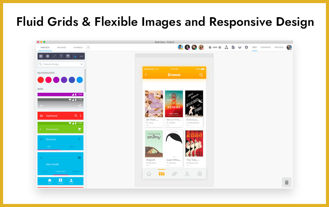
The use of flexible images will prevent distorting aspect ratio of the image or unwanted image cropping when the screen size changes. Web designers use CSS techniques and secrets to get flexible images for the web design.
4. Typography & Responsive Web Design:
Selection of the right typography for your site design is immensely important as it will affect the readability factor and overall design aesthetics.
Choose a typography that will be suitable for various screen size designs and resolutions. Pick your typefaces and font size that will work across devices.
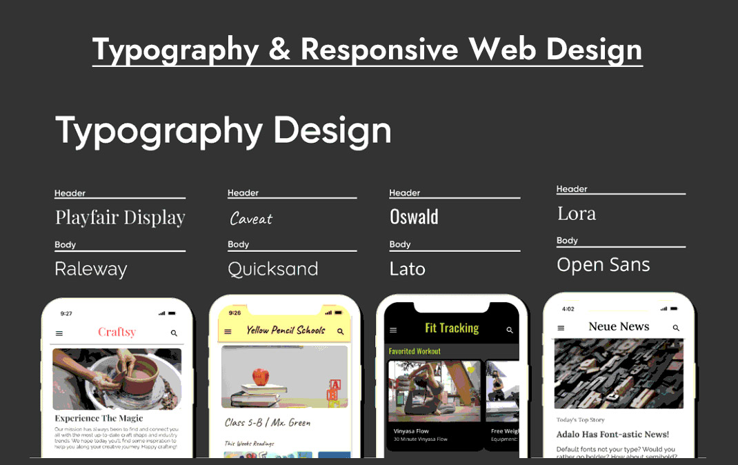
Fonts that can easily scale with changing screen size without losing clarity and visual quality will work best for your responsive web design.
You must establish a typographic hierarchy so that users can differentiate between content and how to prioritize them when reading through the site.
5. Content-Centric Breakpoints & Responsive Design:
Another challenge you will face with responsive design is trying to make your website content look good in different screen types. In such a scenario, one should prioritize the content.
You will determine content breakpoints where your content and design layout complement each other and improve the site’s UX.
6. Misconception Of Hidden Content:
Before the surge of mobile users, the website content visible to a desktop users and the ones visible to mobile users were slightly different in the sense that certain content would be hidden for mobile devices.
However, with changing times and the soaring popularity of mobile devices, it is best not to follow such content segregation. Your target audience is most likely to reach your site through a mobile device, so keep your content visible to mobile users as well.
7. Site Accessibility & Responsive Design:
It is important to work on your site design and optimization in terms of accessibility.
In today’s day and age, a successful responsive website is able to provide a hassle-free usability experience and access to site content for all of its users (including the users with disabilities).
You can customize your site design that provides keyword accessibility, color contrasts for better readability, a screen reader option, and content structured for easy consumption. This way you can develop a website that promotes inclusive UX.
8. Testing Site Responsiveness:
Site testing is a part of development that cannot be missed. Since we are discussing about responsive web design, it is important essential that you run responsive testing to make sure the site is performing as expected across different devices and screen sizes.
The more thorough the testing you conduct, the more are the chances to detect design issues and limitations and what measures can be taken to fix the problem.
Testing will help you create a solid design for your responsive website which will boost the user experience and user engagement.
Conclusion:
Technology is evolving and so is our market of web development and designing. Responsive design is imperative for a scaling business that doesn’t want to stay behind when it comes to reaching the potential customers out there. These were eight responsive web design principles that we recommend you go through before planning your site design. If you need expert advice and professional service, then You Can Call Midas. We provide web development and designing services from India to our worldwide clients.
popular post
-
Must-Have Travel App Features That Can Boost Your Travel Sales

-
5-Step Guide For A Successful Local SEO Strategy

-
10 Essential Colors that make Best Logo Colors

Categories
- Internet Marketing (13)
- Software Development (8)
- Mobile Apps Development (44)
- Web Designing (32)
- Web Development (60)
 business@midaswebtech.com